Okay, so you’ve set up your website.
(If you haven’t set up your own professional website yet, read Part 1 to find out how.)
But how do you turn that website into a client winning machine?
Because throwing up some details about your business won’t cut it. Digital business cards don’t get clients.
You need to build trust and position yourself as the solution to your visitors’ problems.
Freelance web designer Leah Kalamakis says:
“Your website is your #1 sales tool. It’s the first impression you give to potential clients and it’s the space where you have the most opportunity to show people what you can do for them and convert them into paying clients.”
If you don’t do it right, it won’t matter how many people visit your website, you won’t get any clients.
But don’t worry, I’m going to show you how to develop your visual identity and create website content that gets you the clients you deserve.
But first:
The Most Important Part of Your Website
Your website doesn’t exist to tell clients who you are and what you do.
Your website exists to show clients what you can do for THEM.
So, before you start adding content to your site, you need to be absolutely clear about two things:
- Who your ideal client is
- How you can solve their problems
I can’t overstate how vitally important these two things are.
You need to dig deep.
Who exactly are you trying to help? What stage are they at in their business? How does your service improve their lives/business?
If you’re not absolutely clear about the WHO and the WHY underpinning your freelance business, a fancy website won’t save you.
The more you know about your ideal clients and how you plan to help them, the easier it will be to land them.
So if you’re at all unsure, watch this workshop training before continuing. It’ll help you identify WHO your ideal client is and HOW you can help them.
Develop Your Brand Visuals
Your brand isn’t your logo or business cards.
It’s how people feel, think and speak about you.
But you can use things like logos and websites as tools to influence the way people think, feel and speak about you.
Wes McDowell, creative director at The Deep End Design says:
“Branding encompasses nearly every aspect of a business’s personality, including its logo, how it speaks to its customers, and how it is perceived by the public.
Branding is not just for the power players. It’s for every business of any size, including freelancers that want to grow their income and create a powerful reputation for themselves.”
Still, your website is a large part of your business presence.
It only takes about 50 milliseconds (that’s 0.05 seconds) for users to form an opinion about your website.
And this snap judgment will determine whether they stay or leave.
So what will make them leave?
Freelance graphic designer Brent Galloway shares some major design flaws to avoid at all costs:
- Using blurry or stretched images
- Interrupting the viewer’s focus with auto-playing video or audio
- Blinking or flashy imagery to grab attention
- Using more than three different fonts, pairing fonts that clash, or not providing adequate line-spacing (line-height)
- Clashing color schemes like blue text on a red background
- Misuse of stock imagery for key content images like page headers
- Misaligned elements, which makes the flow of your content hard to follow
- Cluttered, tight and compact content
But if you get it right, a signature brand will help you positively influence the way people perceive your business.
A powerful visual identity must be two things above all else:
- It must clearly represent your business
- It must be consistent
How do you make sure your visuals are both of these things?
First, check out some other freelancers in your niche and see what they’re doing.
Next, write down ten words that describe your ideal client. Use words like simple, elegant, edgy, relaxed, minimal, friendly, formal, soft, fun, vibrant, serious, etc.
Then pick the three words that represent them the most.
Now, make sure all of your visuals are consistent with the three words you choose.
For example, if your three words are “formal,” “traditional” and “straightforward,” you’ll want to avoid playful fonts, too much color and an innovative layout.
Now, let’s work through your visual branding, step-by-step.
As we do, keep thinking of your ideal client and your three words that describe them.
Pick a Color That Represents Your Business
The colors you use immediately communicate a lot about your business.
Colors also influence emotions and buying decisions.
In a study called Impact of Color in Marketing, researchers found that up to 90 percent of snap judgments made about products can be based on color alone.
Look at the image below — what color best represents your business?
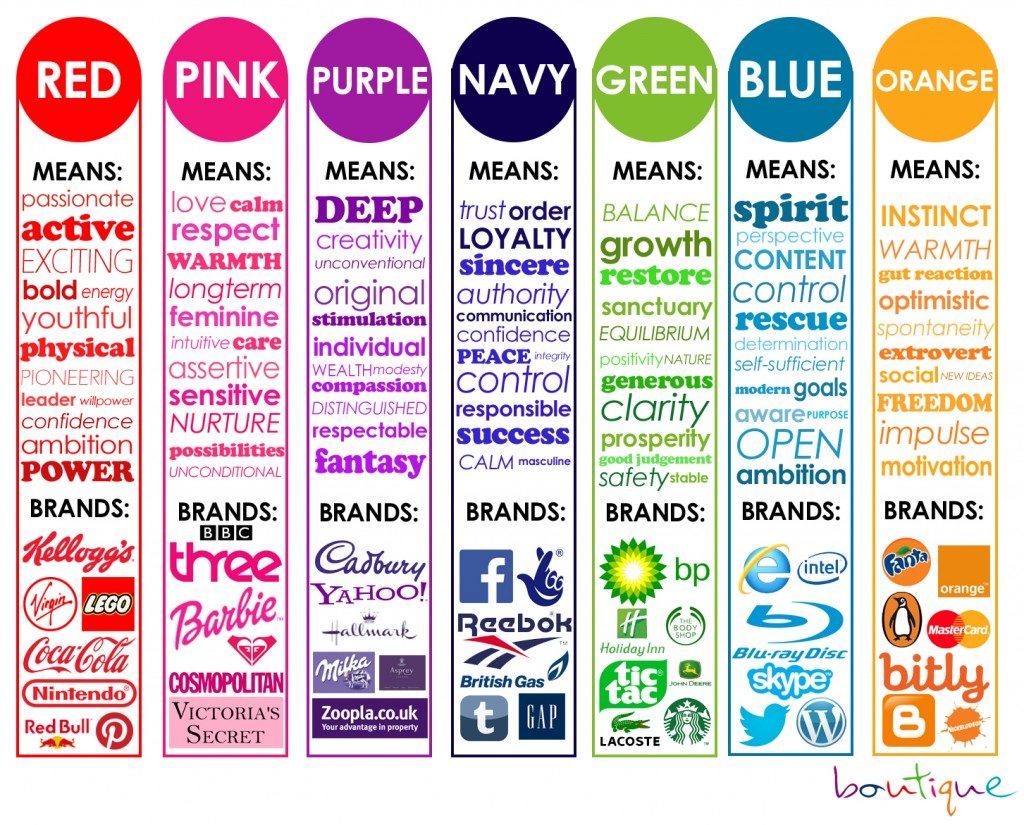
Once again, think about your ideal client.
Kids like color. Heavy metal bands don’t.
And unless you’re a designer, it’s often better to keep things simple by using only one or two colors.
Here, Sarah Anderson uses a distinctive color of blue on her website Spitfire Scribe, along with white and black.
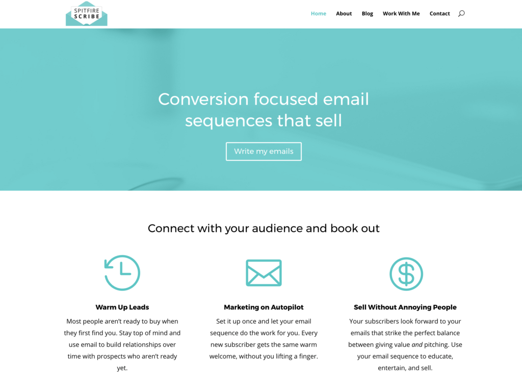
The result is simple, elegant and professional.
Choose a Readable Font That Represents Your Business
There are four main font categories:
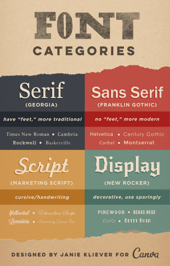
The main choice you have is between Serif and Sans Serif.
This should be a simple choice if you know who your target client is, as Serif is more traditional and Sans Serif is more modern.
Designers often put two fonts together, but one will do.
Here are some ideas for font pairings:
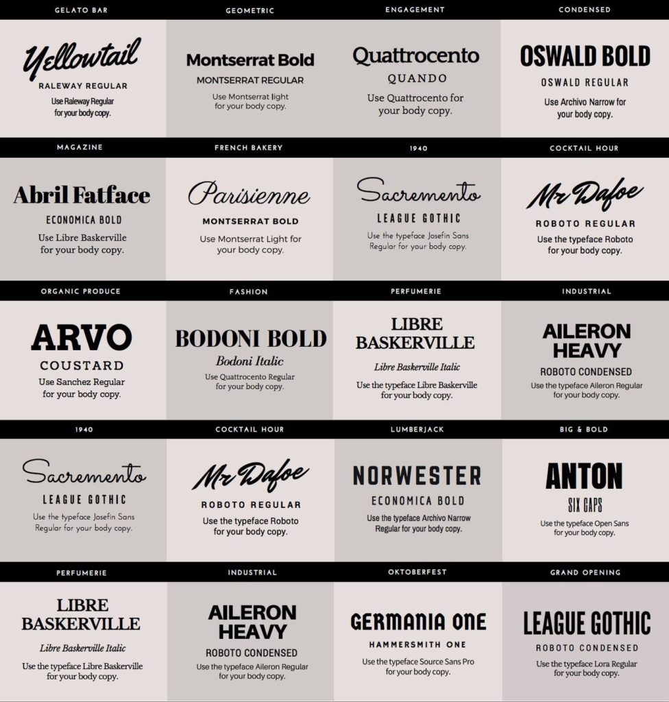
The golden rule? Don’t use more than two fonts as it will start to look messy.
Freelance designer Maximilian Hennebach uses Ariel for his headings and Lora for body text. He’s also altered the spacing of the letters when writing his name to bring them closer together.
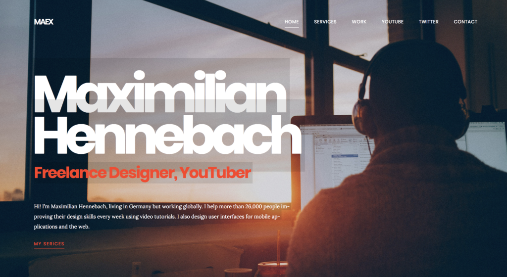
Remember, legibility is crucial when choosing a font. It must be easy to read, even on mobile devices.
Also, try to pick a well-known font, as some lesser-known fonts aren’t compatible with some devices and programs.
If you want to add more fonts to your WordPress site (such as Google Fonts,) you can use this guide from WP Beginner.
Don’t get bogged down in choosing a font, just pick one that’s easy to read and represents your business.
Consider Creating a Logo
You don’t necessarily need a logo.
But it can add a level of credibility and professionalism to your brand.
Many freelancers just go with their name in their chosen font, like Mike Shreeve, head troublemaker at The No Pants Project:

You can use a free tool like Canva to create a logo.
Or for a small fee, you can use services like Logo Maker and Logo Yes to create your own logo with pre-made icons.
If you have a larger budget, you can start a design contest on 99designs, where designers will pitch you with ideas for your logo.
Freelance writer Dan Virgillito goes with a simple ‘DV’ logo before his name.

Unless you’re a designer, your logo isn’t going to make or break your business. So don’t spend too much time on it.
Visual Branding Takeaways
Remember, a strong visual identity starts with knowing who your ideal client is.
So continuously reference your three words that describe them. And make sure your colors, font and any other design elements all fit the same description.
Lastly, consistency is vital for a strong brand image.
So make sure all of your visuals match across your webpages and social media accounts.
Create The Content For Your Site
There are two things to remember when creating the content for your site:
- You’re there to solve people’s problems
- You must build trust
This is why your website is more than a business card or portfolio.
Remember, your website is your number one sales tool.
And you need to hook visitors in fast.
For webpages with 111 words or less, only 49 percent of the page is actually read. And for the average webpage of 593 words, this falls to 28 percent!
So how do you hook people in quickly?
Freelance writer Jordan Roper says:
“The most prominent content on my site is focused on SELLING my services rather than TELLING potential clients stuff that probably won’t affect their buying decision.
Remember, your main focus needs to be showing off your expertise and proving that you are the best [freelancer] to help your target clients.”
Simply put, sell benefits, not features.
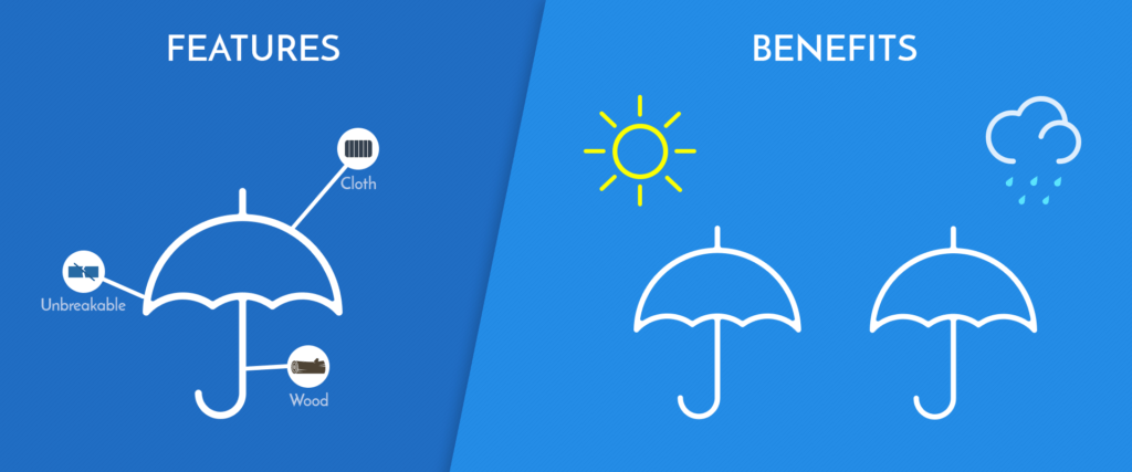
The feature is what you do and the benefit is how it helps the client.
For example, an umbrella’s features are its material and expandable mechanism. But the benefit is that it keeps people dry and shaded.
So what exactly do you need on your website?
Most freelancers include the following:
- Homepage: Establish yourself as someone who can solve the visitor’s problem.
- Call-to-action: Get the visitor to sign up to your mailing list so you can continue to build trust and solve their problems.
- About: Establish yourself as someone who can solve the visitor’s problem while building trust.
- Services: Tell them how you’ll solve their problems and what the benefit of each service is.
- Portfolio: Show them how you’ve solved other people’s problems.
- Testimonials: Build trust by letting your previous clients tell how you solved their problems.
- Blog: Solve people’s problems while developing trust.
- Contact: Make it easy for people to reach you.
Notice a theme?
Okay, before we go through each of those pages, there’s something you need to do:
Decide on your brand’s tone of voice.
Once again, check out other freelancers in your niche and refer back to the three words you used to describe your ideal client.
Will you write formally or informally? Will you use pop culture references?
Once you understand the style of writing that your ideal clients would prefer, you can go ahead and create your site’s content.
Create Your Homepage / Landing Page
Remember, the point is to establish yourself as someone who can solve your ideal client’s problems.
Tell them who you are, what you do and highlight the benefit for visitors.
Freelance writer Karen Smock clearly highlights the problem she solves for clients in writing: “Your source for clear explanations of complex products.”
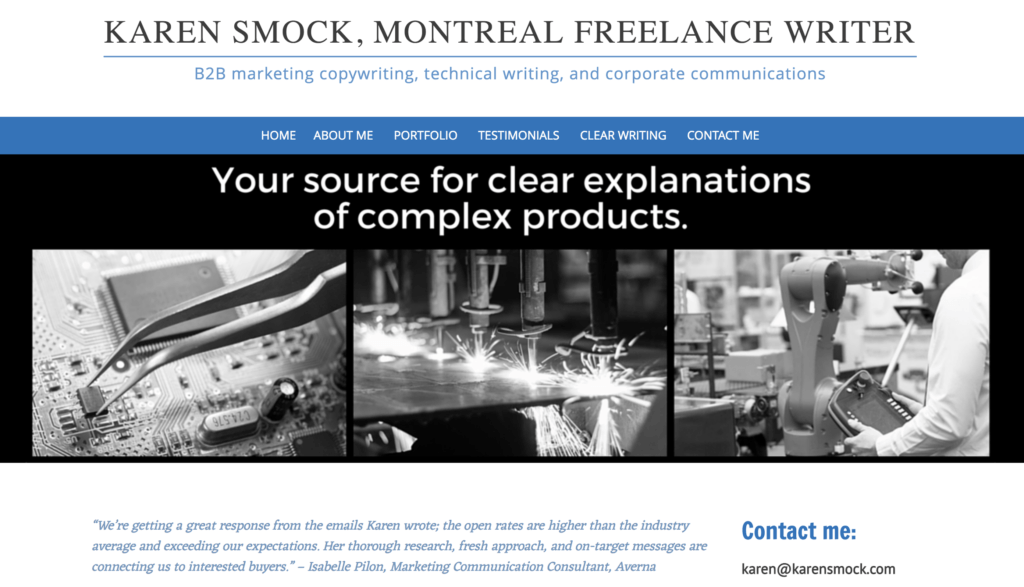
However, I would take this one step further by highlighting how clear explanations of complex products benefit the client.
For example, “Eradicate confusion to sell more.”
So ask yourself what problem you solve for clients and what benefit that brings them.
Then, condense it into one small sentence and place it front and center on your homepage.
Add a Call-to-Action
There are two things you want visitors to do:
- Sign up for your mailing list
- Contact you about your services
Everything on your website should be structured in a way that gets visitors to do one of these two things.
If you haven’t already, make sure you read about how to create a client getting faucet.
Related Post: The 3 Step “CGF” Method For Getting Freelancing Clients On Demand
It’s unlikely that a potential client will contact you about your services the first time they land on your website.
This is why it’s best to focus on getting them to sign up for your email list. This way, you can slowly build a relationship while continuing to market your services to them.
The best way to do this is to create something of value and offer it as a free download.
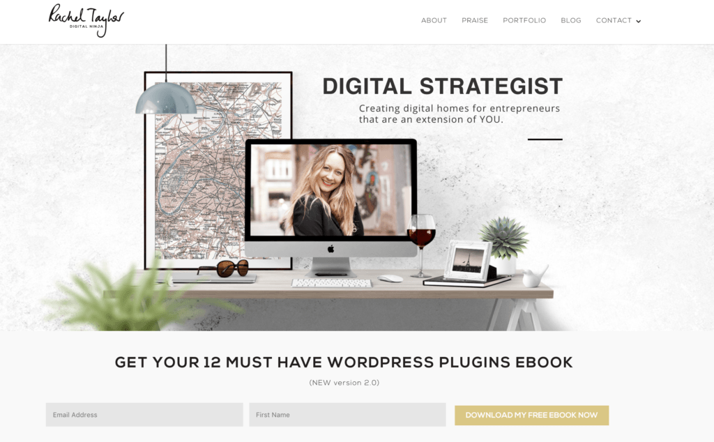
Freelance digital strategist Rachel Taylor offers an free ebook on her homepage:
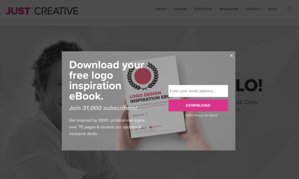
And freelance graphic designer Jacob Cass has a free ebook offer that pops up after you’ve spent a few seconds scrolling on his homepage:
For more tips on creating a landing page that gets results, read this blog.
Related Post: The Ultimate Guide To Freelance Business Landing Pages That Get Results
Write Your “About” Page
Okay, so your website is about how you can help your client, but your “About” page is about you, right?
Nope.
Your About page isn’t about you either.
Potential clients don’t want to hear your life story or how you discovered your freelancing passion, yada, yada, yada …
Save that for your mom. (Moms are the best.)
So what’s it for?
You guessed it: Your About page exists to build trust and establish yourself as someone who can solve the visitor’s problem.
Freelance writer Sarah Anderson nails this:
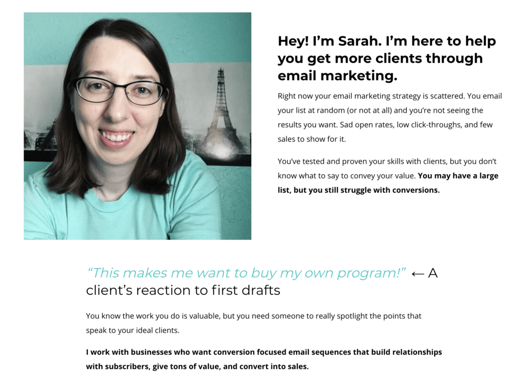
There’s a lot of “you” and very little “I” in her copy.
And everything is geared towards how she is the perfect person to solve the visitor’s problem.
She says things like:
“I work with businesses who want conversion focused email sequences that build relationships with subscribers, give tons of value, and convert into sales.”
Now that’s the stuff potential clients want to know.
Create a Services Page Focused on The “How”
This page is all about how you’ll solve your visitors’ problems.
Don’t just tell them what you do, tell them how you’ll do it and the problem it will solve.
Linders Content does this extremely well:
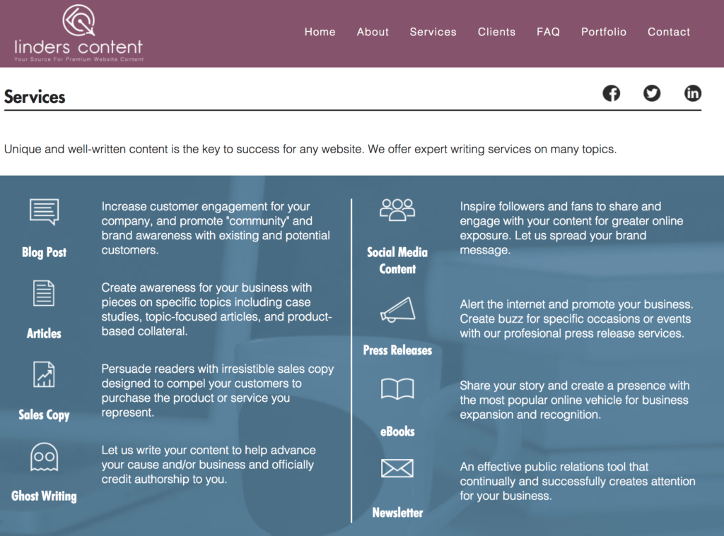
Linders lists the service she provides and includes a handy icon. This is the ‘what’ — ie. “Blog Post.”
Then she includes a paragraph explaining the benefit.
“Increase customer engagement for your company, and promote ‘community’ and brand awareness with existing and potential customers.”
List out your services and then explain the benefits.
Showcase Your Portfolio
Your portfolio exists to build trust by proving that you can actually do the job you say you can.
Avoid including everything you’ve ever done and instead only showcase:
- Your best work — the cream of the crop
- The work you’re most proud of
- Work you’ve completed for high-profile clients
- Work that is most relevant to your target client
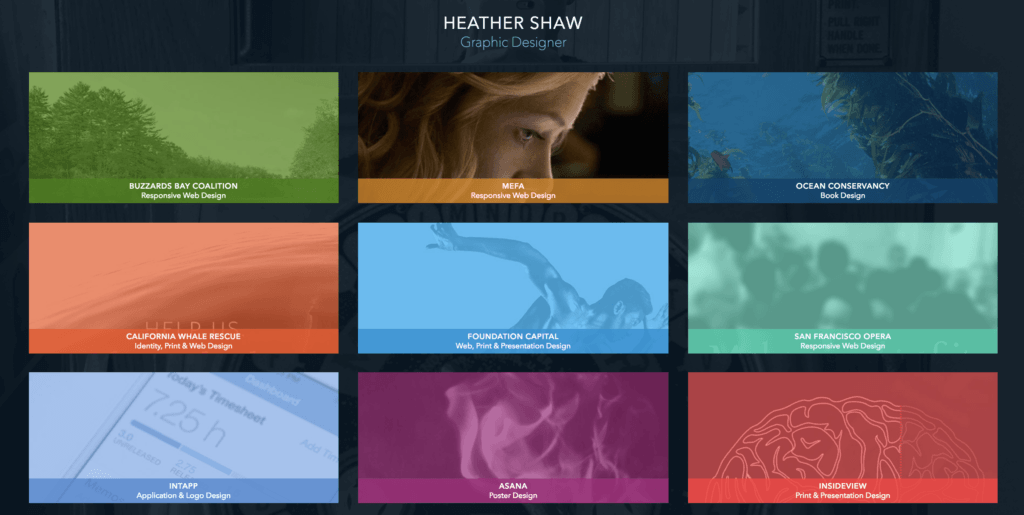
Try to make the layout of your portfolio easy to navigate, like graphic designer Heather Shaw:
If you don’t have any clients or portfolio pieces geared towards your target market and ideal clients, make some.
When I first started freelancing, I didn’t have any published articles or client projects to include in my portfolio.
So, I simply wrote 4 articles that were in my target niche and linked to them in Google Doc files instead.
I landed my first few jobs because clients were happy with the quality of those pieces, regardless of the fact I had yet to be published.
Include Testimonials and Trust Marks
Some freelancers like to have a dedicated page for testimonials.
Others like Jacob Mcmillen prefer to scatter them about their website:
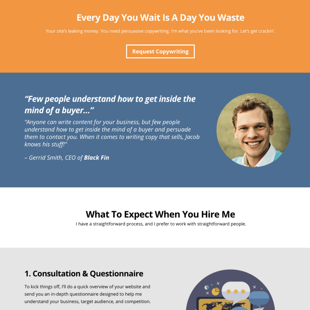
But one thing is certain: Good testimonials are an incredibly powerful tool to build trust and credibility.
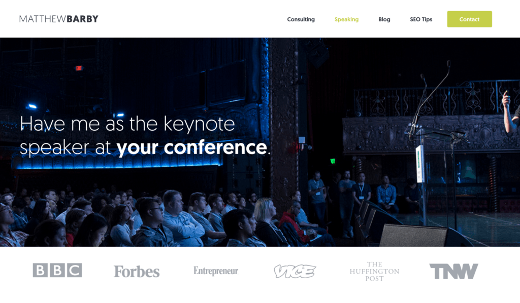
You can also build trust and credibility by including certification marks, the logos of places you’ve been published or businesses you’ve worked with, like SEO consultant Matthew Barby:
If you’re just starting out, you might have business logos or testimonials to display.
That’s okay, we all start somewhere.
But make it a priority to ask every client for a testimonial and start collecting them as soon as you can.
Create (and Maintain) a Blog
Your blog is a place where you can build a relationship with potential clients, demonstrate your expertise and help them solve their problems.
(This could also be the content you include in your daily email.)
Focus on topics that will be of interest to your ideal client. What do they need to know? What can you teach them that will help them now?
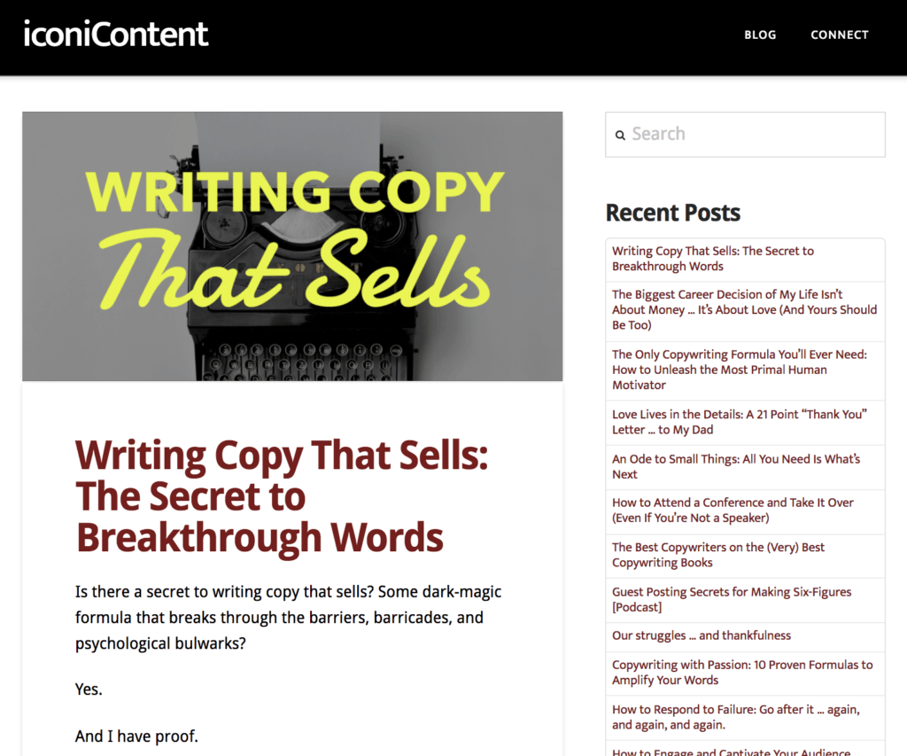
Freelance writer Aaron Orendorff uses his blog to showcase his copywriting expertise and provide value to potential clients.
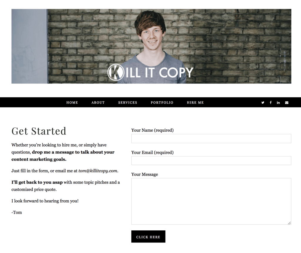
Create a Contact Page
You need to make it as easy as possible for visitors to contact you.
This might mean including contact forms on more than one of your pages. It’s also good practice to include your contact details in the footer of your website.
Still, most freelancers like to include a dedicated contact page.
Final Thoughts
Everything on your website should have a purpose.
So don’t be afraid to hold some things back.
For instance, does your ideal client really need to see your Instagram feed? Unless you’re a designer, probably not.
And don’t feel compelled to link to all of your pages in your menu bar just because you can.
Put the items you most want people to visit on your menu bar and then on those pages link to where you want them to go next.
Remember, it’s not about you, it’s about your client.
Ultimately, knowing WHO you’re targeting and HOW you’ll solve their problems is crucial.
If you would like to build your own 90-day plan to achieve a full-time, profitable freelance business, come join us in The No Pants Project.

![The Ultimate Guide to Creating a Client Winning Freelance Website [Part 2]](https://www.thenopantsprojectblog.com/wp-content/uploads/2017/11/112717_The-Ultimate-Guide-to-Creating-a-Client-Winning-Freelance-Website-Part-2_thumb.png)

