What Are Landing Pages?
(Landing pages are not what you think, for starters.)
In general, a landing page is a web page designed solely to get traffic to take a specific action.
(Need an example? Here’s The No Pants Project landing page.)
Buy your product, subscribe, become a member, invest, sell their souls.
Problem is when you Google “landing page”, you get something like this.
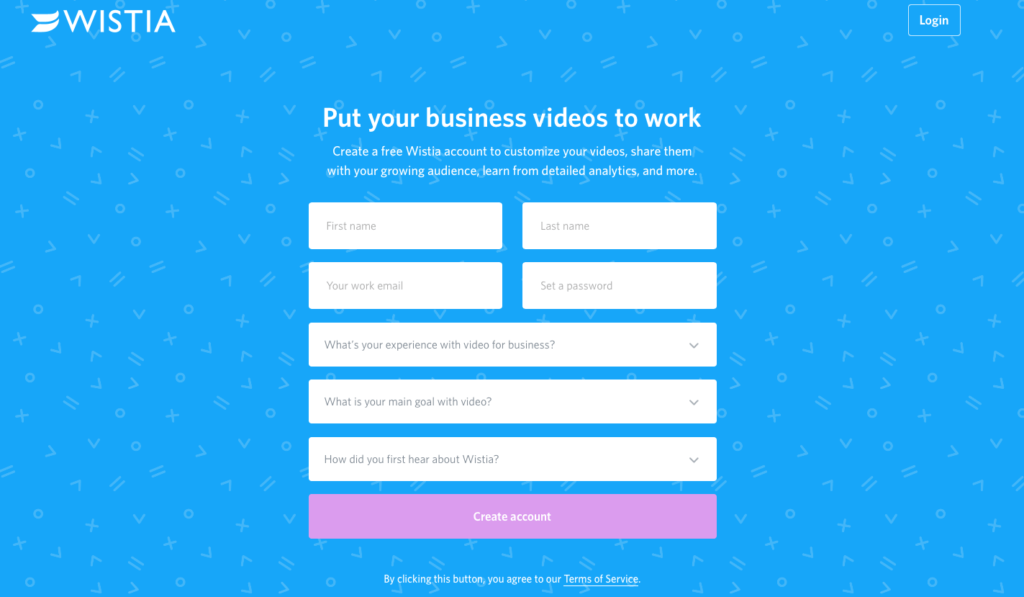
It’s achingly beautiful.
It’s also useless as far as freelance businesses go.
See, freelance business landing pages are a little different than “normal” landing pages. You’re not selling a product directly – not 90% of the time, anyway.
You’re convincing a prospect to hire you.
That gorgeous page has nothing that tells a prospective reader about you. It proves nothing about your work history or quality. It’s not a freelance business landing page.
Examples are weirdly hard to come by through Google.
So all you’ve got to do is build one off your own back with no idea of where to start.
Don’t worry – this guide has you covered.
All you have to do is…
- Plan it
- Write it
- Build It
- Test it
(I didn’t say it would be easy.)
Sure, it’s a lot of work, but great landing pages can skyrocket your freelance business into cloud nine conversions.
See, the average, run-of-the-mill landing page converts at 2.35%. That’s okay.
The best landing pages convert at 11.45% or higher.
If you want to get into that top bracket, you need to do your homework and think this through.
But how do you build one, if you’re not a global business/writer/salesperson/designer/coder/unicorn?
More importantly, how do you build one that’ll smash your targets and boost conversions through the proverbial roof?
Don’t worry, it’s all possible with this guide. Knuckle down.
Three Golden Rules For Business Landing Pages (If You Want To Get Results)
Golden Rule #1: No Nonsense
Never lie, fabricate, exaggerate or cover everything with exclamation marks in the hopes of disguising a baseless claim.
Would you trust this headline?
“LOSE 50 STONE IN TWO DAYS – GUARANTEED!! THIS PRODUCT WILL CHANGE YOUR LIFE AND MAKE YOU THE MOST ATTRACTIVE PERSON IN THE TOWN!! BUY NOW!!”
Um, no.
It’s shady. It smacks of a greasy used car salesperson. It’s full of bold claims without proof.
Not the kind of business you want to buy from.
Your offer shouldn’t be boring, but it shouldn’t be false. There’s a difference between embellishment and fabrication.
Embellishing is fleshing out an offer, making it enticing and teasing at solutions.
Fabrication is making things up.
Golden Rule #2: No Waffle
Keep it tight, keep it sharp, keep it concise.
What does this brilliant landing page from White Gorilla not have?
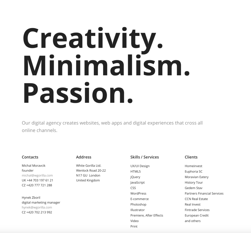
Non-essential copy.
It gets the job done without pages and pages of fluff. It doesn’t even have any colours.
Make no mistake – most landing pages need lots more writing. But filling a landing page with non-targeted exposition is a quick route to customer boredom and high bounce rates.
Trim your content. Give every single word a purpose. Keep your customers focused.
Golden Rule #3: No Ambiguity
If a customer isn’t sure what to do next, the landing page has failed on a spectacular level.
There should be no question of how to proceed. The customer journey should be smooth and easy with big signposted goals.
Ensure the next steps are smack-in-the-face obvious. Tell the customer what you want them to do and make it easy. The simpler the customer journey, the more likely they are to get on board.
Now you know what to avoid, let’s see what you need to do.
Stage One: Write It
In a nutshell, a freelance business landing page should include…
- A cracker of a headline that gets attention and keeps it – only 8 out of 10 people will read it, so it needs to be perfect
- A snappy “about” section that seduces your prospects
- The services you offer and why they’re awesome – and an easy route to find out more
- Social proof from past clients – testimonials, reviews, effectiveness of your work (maybe a blog you wrote boosted conversions by 150%?)
- Some examples of work in a portfolio
- An opt-in form or CTA
Not necessarily in that order, but those are your bare bones. Headline, bio, services, proof, portfolio and closer.
So how do you even begin?
1. Work Out Your Buyer Persona
A good landing page acts like a bouncer. Your perfect customers get through the door and to the goods. Unsuitable customers get politely turned away.
But first you need to know who you want in your club.
Picture your perfect customer. If you don’t have a buyer persona on your desk somewhere, make one now – nothing’s going to happen without it.
Put them on paper. Age, gender, location, career, life goals, possessions, wants, hopes, dreams.
Once you know them better than their mother, figure out their problems.
What makes them dread Mondays? What keeps them up at night? What’s their biggest pain point?
Once you know what they want, you can position your offer to solve their problem.
Your offer should be niche, tailor-made for your perfect customer.
They feel special, individual – like you know exactly what they need. (Which you do.)
If you’re not sure, run focus groups and surveys, interview customers over the phone. Find out their pain point – because you’re going to fix it.
2. Nail Your Offer
Multiple offers crash your conversions. Landing pages with lots of shiny offers actually get up to 266% fewer leads than condensed, focused landing pages.
Your offer might just be clicking through to your services page, if you’ve sold yourself well enough.
But If you want to offer a lead magnet – or a freebie – you need to be pretty imaginative. A free consultation is lovely, but you’re going to be consulting anyway if a prospect hires you.
Instead, offer a solution that leads to you – but could do without you.
“Sell” a free product – an eBook, a strategy, a checklist, a swipe file – that positions you as an industry expert. Something customers would gladly hand their emails over for.
Once you’ve got a line to them, you’ve got a line to their business.
3. Grab Their Attention With A Great Headline
You need a killer headline. End of discussion.
90% of visitors who read the headline read the CTA copy.
Basically, you’ve got to get the headline right.
There’s a few different methods for this. Try out a range of them and see what works for you. (Be warned: this is a painfully stereotypical, exaggerated example for a freelance tutor to draw inspiration from.)
The Promise
Learn To Speak A New Language In Seven Days
The “How-To”
How To Learn A New Language In Seven Days
Expert Says
Linguists Call It “The Revolutionary Method To Learning Languages In A Week”
Method
The Week Long Programme To Completely Learning A New Language
The Question
Do You Get Embarrassed Going Abroad And Not Knowing The Language?
The “If”
If You Can Do This For Ten Minutes A Day, You Can Learn A New Language In A Week
The “Even If”
How To Learn A New Language In A Week – Even If You Work Full Time (this one is great for Facebook ads!)
This is an exaggerated example, but the methodology works.
In your eBook or free report, you won’t actually be teaching your prospects how to learn a specific language. You’ll be sharing methods for study, concentration techniques and focus areas.
Just enough crucial information to get their mouths watering and wanting more.
Spend time here. Slave over your headline. Hire a professional writer if you’re not sure. You need to be…
- Clear
- Persuasive
- Focused
- Urgent
- Bold
It takes time, but without a targeted headline, your landing pages simply won’t convert.
4. Don’t Be Gross With Sales-y Copy
You’re not a dealership, so avoid big icky promises dripping in sales lingo.
Avoid done-to-death and untrustworthy phrases like…
- Once in a lifetime
- Changing the industry
- To avoid disappointment
- On-demand
- Exceeding expectations
- The best
Ew. Even if they’re all true, no one will believe it.
Don’t use big words when little ones will do. Keep sentences short and snappy. Avoid exclamation marks, red text (unless it’s in your brand style guide) and capitals with underlines.
Be evocative and truthful. Be human.
Now fill in the rest of the gaps. Write your…
- About section
- Services section
- Testimonials section (get real ones – don’t make them up)
- Portfolio
- Opt-in form or CTA
Make sure the tone is consistent, the copy is as brief as possible and the offer is inviting.
But don’t get too attached.
You might not need every single bit of it. You might only need 10% of it. So long as it gets the message across.
Don’t be scared. The next step takes your copy and makes it work.
Stage Two: Build It
So you might be thinking that all freelance business landing pages look pretty similar.
I see your thinking, but they come in all shapes and sizes. Let’s look at a few from different freelance industries – and steal ideas.
Getting inspiration from great freelance landing pages is a great strategy if you have no idea where to begin. Just don’t copy and paste, that sucks.
It doesn’t matter what you’re selling – there’s no one “right way” here. Look at pages from other industries – combine a design you love with copy tricks from another.
Find your perfect formula – then build it.
Designer Landing Pages
Justin Aguilar
This is all about the visuals. But that’s the point if you’re a web designer.
Justin Aguilar has a strikingly bare header hits you between the eyes. The lean 46 word lede compels you to scroll.
Then it’s a feast for the eyes. An overall colour scheme and glorious photography utterly charms you.
If you’re a photographer or a designer, there’s no need to write pages and pages. That’s not what you’re selling.
Obviously you’ll need content to move customers along, but they’ve come to you for visuals, so flaunt them. Make the landing page itself a portfolio.

JUST Creative
Simple, muted colour scheme with pops of awesomely obnoxious hot pink – you can tell he’s a graphic designer by how unbearably beautiful the whole thing is.
In his landing page, he covers his identity, his clients, testimonials, awards and a “more” section that leaves you feeling guilty about how little you’ve accomplished in life.
If you can realistically put a “philanthropy” section on your landing page, you’ve pretty awesome.
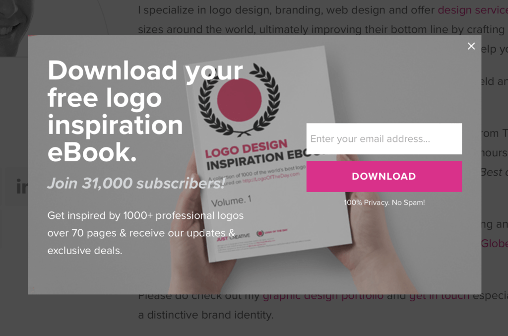
And dang if he doesn’t have an equally beautiful opt-in lead magnet.
(Opt-in science and lead magnet juice is a blog for another day.)
Freelance Graphic Designer
David Pugh is a freelance graphic designer, and he’s one of the only freelancers in history who has managed to get a big, bold telephone number and scrolling banner onto his page without being vomit-worthy.
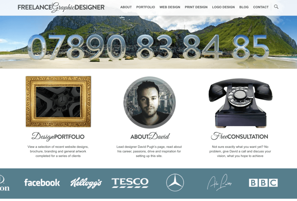 The page as a whole has a bit much going on. But he can get away with it because he’s a big deal.
(If you can get hold of the ‘www.freelancegraphicdesigner.co.uk’ domain, you’re doing fine.)
His client list is drool-worthy and he knows it – so he’s smacked it on the middle of the page in a muted scrolling banner, tiptoeing the line between extroverted and invasive.
It won’t be to everyone’s taste – but he doesn’t care. His achievements and accolades speak for themselves.
He’s only after clients who know what they want and are prepared to get straight on the phone to close a deal. He’s not interested in cold leads.
If your leads already know exactly what they want, move your accomplishments and client list to the front and shimmy your sales copy a little lower.
Marketing Landing Pages
John Gonzalez | Digital Marketer + Creative Hero
His logo is his first name and nothing else.
It’s irritatingly brilliant.
Even moreso is his sassy copy – as a marketer, he knows that customers react to a jibe – his “Don’t Scroll Down” CTA will either trick you into doing just that, or amuse you so much you decide to do it anyway.
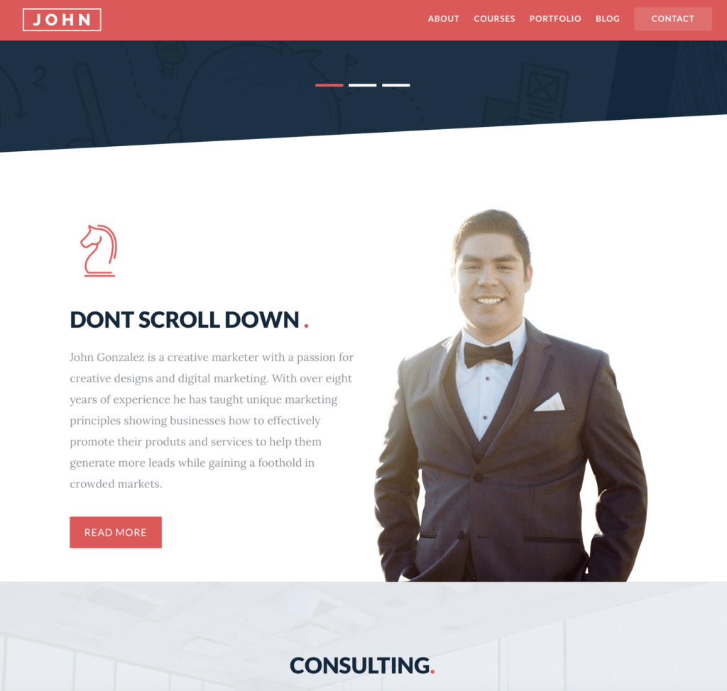
His landing page flow is logical and seamless, from a punchy introduction to services, testimonials, products and an opt-in. It runs on personality and it’s magnetic.
Showcasing personality breeds trust with your readers.
Prospects wants to interact with a person, not a robot.
Let yourself shine through, even if you’re hiring a copywriter. Consult with them to figure out a brand tone of voice.
If you’re generic, your readers will get bored and punish you by clicking away to find someone more interesting.
Rachel Taylor | Digital Ninja
Rachel Taylor, a digital strategist, takes a slightly different approach.
Instead of first directing you to services or testimonials, she immediately offers you free stuff.
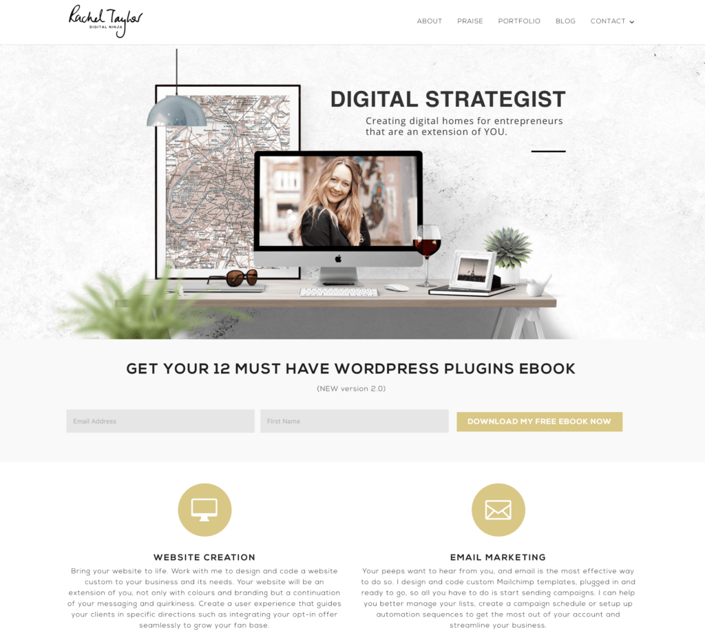
Her eBook, “Get Your 12 Must Have WordPress Plugins”, seems ridiculously useful.
Make no mistake, it’ll be written to direct readers to a sale. But it immediately establishes her as someone who puts the customer first. She demonstrates expertise and personality in one fell swoop.
Who wouldn’t want to do business with someone like that?
You run the risk of freebie hunters grabbing your lead magnet and leaving, but you’ve still got their email.
Use it to run a sales eBlast or series. Nurture the lead and bring them back to the services.
Copywriter Landing Pages
Turner Ink
This one has money behind it, no mistake. That’s not a free template.
But it rocks.
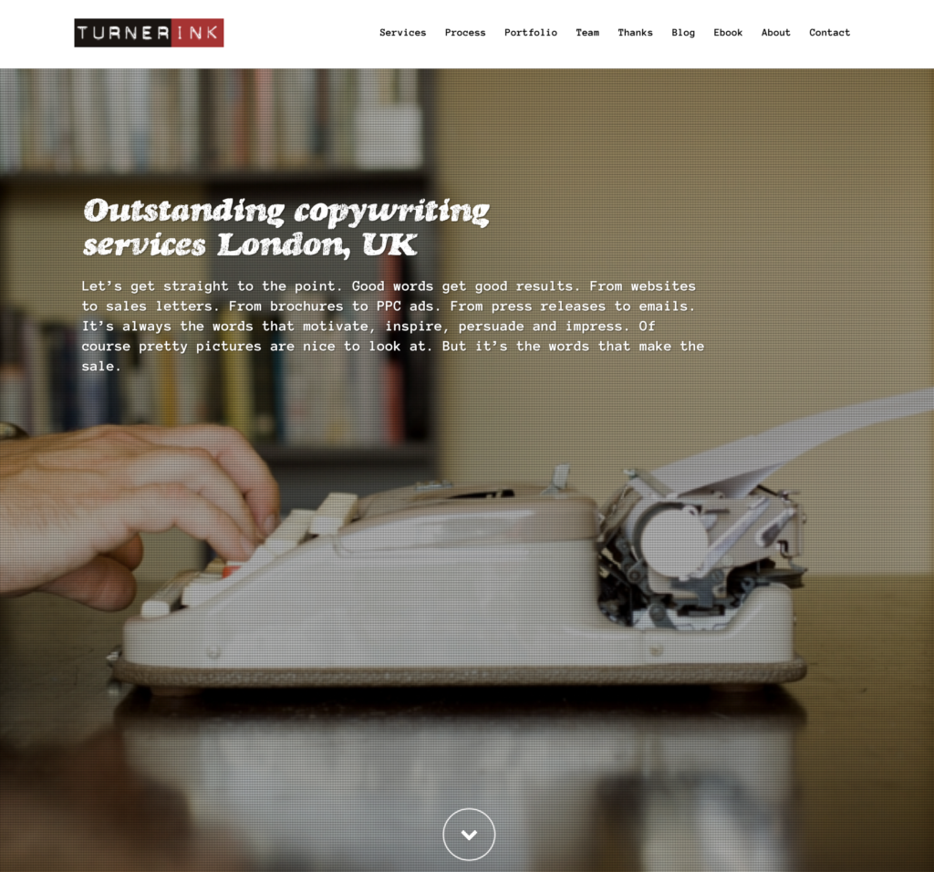
Above the fold, there’s one paragraph that sells this copywriter’s service. One paragraph.
![]()
And it nails it. It’s snappy, visually impressive, and tells you everything you need to know without sales.
The menu is in standout white so you know where to go next, and in case you miss it, there’s a great big stinking arrow at the bottom pointing you to the rest of the page – and her veritable feast of services.
More importantly, the end of the page has a kick-in-the-face CTA so you know what to click next.
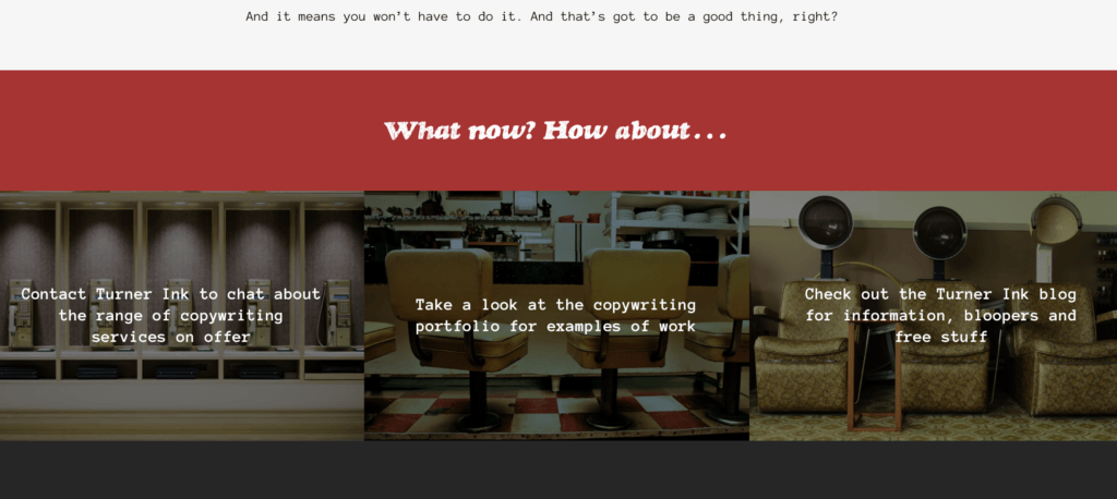
You can’t really get lost here.
Sally Bacchetta
Talk about minimalism.
Sally Bacchetta is a freelance writer and “instructional designer” – sounds cool – and the whole page smacks of corporate professionalism. She doesn’t need fancy visuals to get the readers moving.
There’s a bio picture. A standout title with no fluff or fuss. She’s positioned her three main services above the fold with clear buttons directing you to their respective pages.
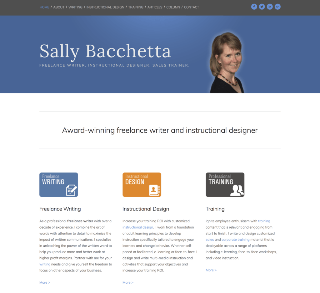
The rest of the landing page has personal information, testimonials and recent news, but that’s only there to mop up accidental scrollers. The top part of the page captures interest, explains plainly what she does, and directs you to services with tonnes of white space to spare.
No nonsense.
Frank Kern
Frank Kern is a direct response heavyweight, so you’d expect his landing page to be full of amazingly persuasive text.
Actually…
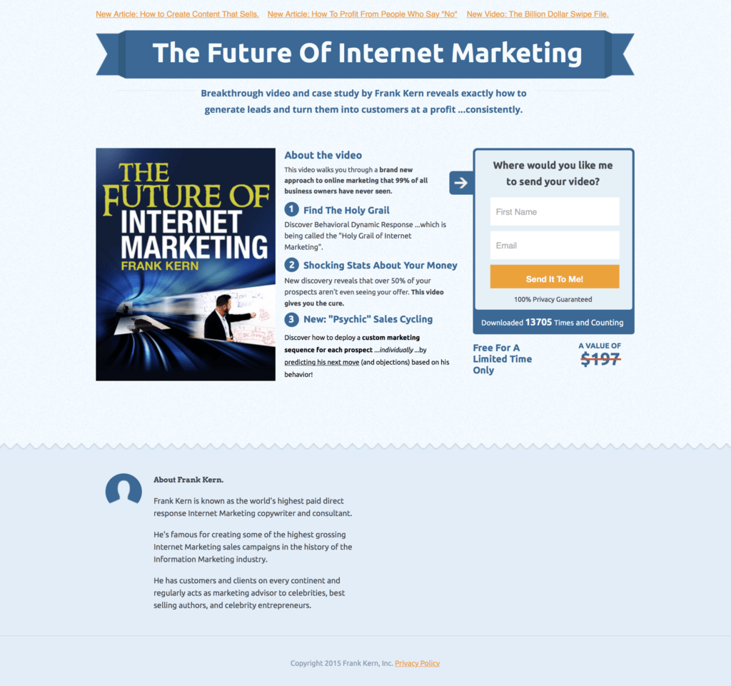
There’s no scroll. That’s it.
A grand total of roughly 215 words.
He’s not even directly marketing himself – he’s selling an eBook. The closest to a “traditional” landing page on this list.
But in those measly 215 words, he sells the eBook and himself. He sneaks in a whole lot of subtle psychological sells – download volume, discounts, and a tiny but powerful bio squirrelled at the bottom.
The golden goose of the whole page is the simplicity of the opt-in form. You’ve read all his stats and you’re sold – so he makes the process of actually signing up easy. Two fields and a big orange button.
He covers urgency, social proof, value and simplicity.
It’s masterful.
Bonus Landing Page
Joe Coleman
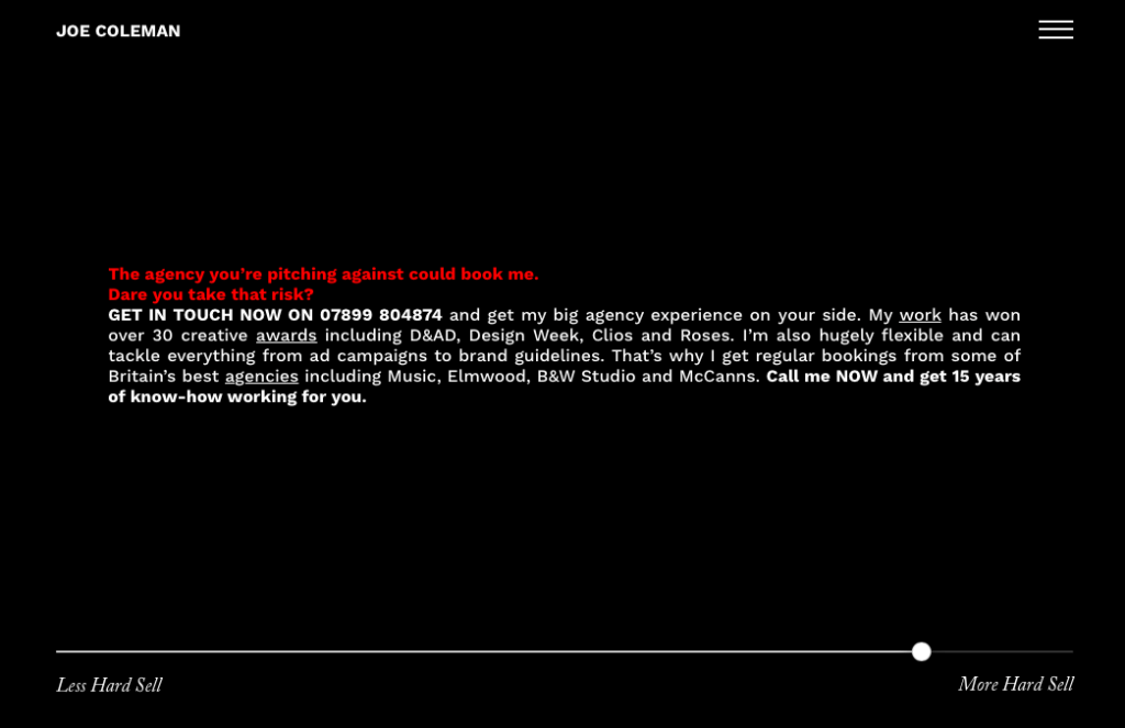
This is possibly the greatest landing page of all time – if you’re a writer.
There’s no client list. There’s no testimonials. There’s not even a portfolio until you go looking.
But that doesn’t matter.
You’ll need a coder for this one. But if you’ve got the chops, it’s worth it.
Warning: there are explosions, cats, strobe lights and exclamation marks. And he breaks every single landing page writing rule.
How Do You Actually Build A Landing Page?
Unless you are a coder, or you’ve got one hidden under your pillow, you’ll want to use a professional builder to get the results you want.
Not all landing page builders are created equal. Some don’t allow you to A/B test and some have so few templates you may as well learn HTML and do it yourself.
Clickfunnels is a brilliant software tool to not only create landing pages, but build high-conversion sales funnels. It gathers leads and directs them, something other tools can’t do. It’s got a template for everything and even comes with a trunkload of analytical abilities.
You should try it out / I use it all the time / take a look.
Optimize Your Page
SEO is a thing. Deal.
Search engine optimisation is important for any web page. The art of making Google love you powers entire businesses.
You need to make sure your page is…
- Mobile Optimised
- Has optimised meta descriptions and title tags
- Uses H1 tagged headlines
- Has clean URLs
- Is non-spammy
- Is valuable
Don’t hide keywords in white space or pay for lists. You don’t want to get penalised by Google and lose out on potential prospects. Quiz up on modern SEO and keep your ear out for Google updates.
Stage Three: Test It
Don’t get attached – headlines need to be changed every few years to keep their ‘oomph’ as markets evolve.
It’s worth it. Refining your landing pages can push conversions up by 300%.
Now What?
Landing pages take a lot of time. There’s a lot riding on them.
Stay on top of trends, consider having more than one landing page for different facets of your business, stay focused and track your results.
Plan, write, build and test. And keep on testing.
Remember…
- No Nonsense
- No Waffle
- No Ambiguity
Sell to your target customer. Keep it clean, concise and targeted.
Then…
- Get their attention with a smacker headline
- Tell them who you are and what you’re offering
- Prove you can deliver
- Then take them there
Don’t forget to make it look good. Even if you’re not a designer, a sophisticated style is critical. Use a Clickfunnels template to keep it professional, striking and snazzy. Keep your branding consistent.
It can be worth it. Moz reeled in $1 million a year with an optimised landing page.
Sure, they’re not a freelance business. But it’s a start.
Need Help?
If you’d like more help building your freelancing business (landing page PLUS everything else that goes into a successful freelance business), come join us in The No Pants Project.
If you’re serious about making your freelancing business work, our coaching and mentoring program is for you. Come watch this free training video for more.
